

Showing posts with label Layout Designs. Show all posts
Showing posts with label Layout Designs. Show all posts
Wednesday, September 12, 2012
Layout Designs: 2013 Save the Date
2013 Save the Date postcard - this is getting handed out at the Masons of California Annual Meeting next week.


Monday, July 2, 2012
Thank you card
A thank you card for a family I visited in Australia, pretty simple put one of my favorites!


Thursday, June 14, 2012
Layout Design: CMS Program
Previously posted was the new California Masonic Symposium
branding/logo. As the first session of this yeas symposium is getting closer it
was time to design the program. Although there are two sessions, June and July,
the same program will be handed out at both.
To keep with the branding the color scheme of the program
stayed consistent with the logo through the program. This year had a few more
speakers which turned the program into a tri-fold rather than half-fold, like
previous years.


Layout Design: MHC Invitation
Masonic Homes of Covina are putting on a summer event for
residents, family and friends. To get people excited about the event we needed
to design an invitation that would be distributed throughout our organization. Clean,
simple, modern typographic design was the best solution for the invitation
since the target audience was rather broad.

Tuesday, June 12, 2012
Layout Design: Woodland Food Closet Brochure
The Woodland Food Closet helps provide meals for families
that are unable to afford groceries to feed their family.
Along with designing their website, I was hired to design a
tri-fold brochure to be handed out at events and available in the office. To
keep with the design style for the organization consistent I applied the same
design from the website for their brochure. The donation form is perforated to
allow people to easily detach it from the brochure to make their donation.
To learn more visit: www.woodlandfoodcloset.org


Website: Woodland Food Closet
The Woodland Food Closet helps provide meals for families that are unable to afford groceries to feed their family. After years of operation the food closet hired me to design a simple easy to use website that would get their message across to a wider audience. Being able to donate through the website was a key component they wanted available on their site. Along with knowing what events and services the Woodland Food Closet provides year around to the Yolo County Community.
To learn more visit: www.woodlandfoodcloset.org


Tuesday, April 10, 2012
Logo/Branding Design: CMS
The Masons of California offer a number of different educational materials, classes and seminars for our members. Each year we put on a Symposium that has a different topic related to Masonry each time. This year, the organization thought it would be a great idea to add some sort of logo/branding to this part of our programing.
Since the Symposium is organized each year it needed to be adjustable, modern and visually appealing to our older members. The simple design I came up with, shown below, is easy to read and gets the messaging across as to what and where the current years Symposium will take place.

Since the Symposium is organized each year it needed to be adjustable, modern and visually appealing to our older members. The simple design I came up with, shown below, is easy to read and gets the messaging across as to what and where the current years Symposium will take place.

Layout Design: M & W Retreat Invitation
Last week I shared the new branding created for the Masons of California's Masters and Wardens Retreats for the upcoming years. There were many pieces of collateral for this project, displayed below is just one of those pieces that were distributed to our members via email.


Saturday, March 31, 2012
Layout Design: LMCP Postcard
Yesterday, I posted the new logo for LMCP for the Masons of Ca. Earlier this month I created a postcard that was handed out to members at a retreat in Northern California. The postcard was to get our members thinking about participating in the program. It acted as a "save the date" sort of promotion since all the program dates and times are still pending.
The design was kept simple and easy to read and understand. It was the first time the new logo was being displayed to our members and it needed to be memorable. By keeping the design clean and simple, it allowed the logo to pop making it grab the reader's attention. There will be more promotional materials for this program that will follow this design style.


The design was kept simple and easy to read and understand. It was the first time the new logo was being displayed to our members and it needed to be memorable. By keeping the design clean and simple, it allowed the logo to pop making it grab the reader's attention. There will be more promotional materials for this program that will follow this design style.


Tuesday, March 27, 2012
MCYAF Ads
These MCYAF (Masonic Center for Youth & Families) ads were designed to be for non-members and past or current members. The photographs are stock images and our editorial staff wrote the text. Since these ads are being placed in industry related publications they needed to stay simple and within the MCYAF branding...all while being engaging.
The photographic ads were designed to target non-masons who might need the services the facility provides. The typographic ads were designed to target all Masons within our organization. One of the typographic ads was published in the April/May 2012 issue of the California Freemason Magazine as well as on the freemason.org.


The photographic ads were designed to target non-masons who might need the services the facility provides. The typographic ads were designed to target all Masons within our organization. One of the typographic ads was published in the April/May 2012 issue of the California Freemason Magazine as well as on the freemason.org.


Monday, December 5, 2011
Ad: Rainbow for Girls
Rainbow for Girls is one of the many youth orders connected with the Freemasons. This ad was created to congratulate the girls on their 2012 Grand Assembly.
I wanted this ad to be intriguing and elegant like the young ladies participating in the organization. It is for all the girls associated with Rainbow for Girls, so using photography would only single our certain participants. Typography was a perfect solution for this advertisement. This ad is one of my favorite designs I've created since working with the Masons.
Below are two versions of the ad. The first is my original design and the second is the one being published. Although there were corrections to the first version, it is still my favorite.


Wednesday, November 23, 2011
Layout Design: C2 101
Yesterday I posted the logo and description of the project this web application was created for. Below is the visual layout design that I designed for this college cooking web application. The layout is simple, clean and focused more on the typography rather than the amount of design that is on the page. Sticking with the simple colors was important in order to complement the logo design.Using a 3-column grid makes it easy for the user to navigate through the site, allowing them to know exactly where and what all the links and pages are about.
Now all I need is to actually build the web application and it will be on its way.
Now all I need is to actually build the web application and it will be on its way.
 |
| C2 101 | Home Page - Web Application | October 2011 |
 |
| C2 101 | Sign Up Page - Web Application | October 2011 |
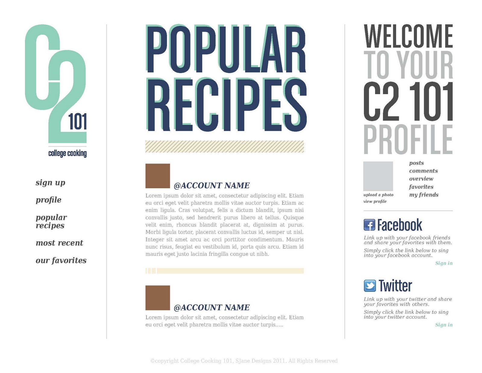 |
| C2 101 | Popular Recipe Page - Web Application | October 2011 |
 |
| C2 101 | Most Recent Page - Web Application | October 2011 |
 |
| C2 101 | Our Favorites Page - Web Application | October 2011 |
Tuesday, October 11, 2011
Save the Date | Postcard
After Annual Communication the year takes off with many events and retreats. As a way to keep our members informed with upcoming events we created a Save the Date postcard that was distributed during the conference at the registration desk. No most post cards just have a bunch of text and look ordinary and ugly. For this years I wanted to do something a little unique and keep the text to a minimum.
We didn't want to have our members complain that their event/retreat wasn't at the top. To resolve this issue we structured the postcard to be able to have either one on the top. No matter what way you rotate the card the top portion is always readable....
We didn't want to have our members complain that their event/retreat wasn't at the top. To resolve this issue we structured the postcard to be able to have either one on the top. No matter what way you rotate the card the top portion is always readable....
 |
| Save the Date | Postcard | September 2011 |
Tom Torlakson Event
A few months before Annual Communication our Philanthropy department had an event for a special group of people. We had Mr. Tom Torlaskon our Superintendent come and speak to members of the Grand Lodge and the San Francisco School Alliance. Instead of sending out an email blast we decided to create an online invitation where we could keep track of who was actually attending. Over 120 people were invited and roughly 60 people actually attended.
For the online invitation I didn't want to use some random template that had no relevance to the event. I chose to create the below graphic. Its simple and uses both the School Alliance logo & colors as well as our Philanthropies as well. As the event came closer we used this same template for elevator & lobby signs as well as name tags. The event was just as successful as the event itself.
For the online invitation I didn't want to use some random template that had no relevance to the event. I chose to create the below graphic. Its simple and uses both the School Alliance logo & colors as well as our Philanthropies as well. As the event came closer we used this same template for elevator & lobby signs as well as name tags. The event was just as successful as the event itself.
 |
| Tom Torlakson Event | Invitation Graphic | July 2011 |
Monday, October 10, 2011
GM Project | Raising A Reader
Each year a new Grand Master (GM) is installed into his position within the Masons. Each GM has their own special project that will take place throughout the year. Last year the GM's project was called By Your Side....which raised money to certify a large number on oncology nurses. This year our GM is focusing on Literacy within our Public School system. The Masons of California are partnering with Raising A Reader.
To kick start this years project I designed a bookmark that was handed out after the new GM's installation and presentation of the new project (the partnership logo was designed by my manager Angel). I didn't want to create a normal boring skinny bookmark that everyone wouldn't like so I chose to go with a square bookmark, something you don't see everyday. It turned out pretty well and the GM was happy, thats all that matters.
To kick start this years project I designed a bookmark that was handed out after the new GM's installation and presentation of the new project (the partnership logo was designed by my manager Angel). I didn't want to create a normal boring skinny bookmark that everyone wouldn't like so I chose to go with a square bookmark, something you don't see everyday. It turned out pretty well and the GM was happy, thats all that matters.
 |
| Grand Master's Project | Raising A Reader | 2011-2012 |
 |
| Grand Master's Project | Raising A Reader | 2011-2012 |
Sunday, October 9, 2011
Ladies' Tea Program
During the 2011 Annual Communication the Grand Masters wife held her own event for the members wives while the men were in session. She chose to do a Ladies' Tea and talk with the women about the year and her husbands By Your Side project. It gave the chance for the wives to way in on a number of different topics.
Mrs. Bray wanted to have a program for each lady who attended the event that represented a vintage style. To show a vintage style I didn't want to use bright colors but ones such as ivory (for the paper), brown and a shade of green for a little pop. The one requirement was there had to be a tea pot of any style. Since we were going with a vintage program I wanted to keep with that theme and include a vector vintage teapot with a simple ornamental to provide a little bit of depth.
Mrs. Bray wanted to have a program for each lady who attended the event that represented a vintage style. To show a vintage style I didn't want to use bright colors but ones such as ivory (for the paper), brown and a shade of green for a little pop. The one requirement was there had to be a tea pot of any style. Since we were going with a vintage program I wanted to keep with that theme and include a vector vintage teapot with a simple ornamental to provide a little bit of depth.
 |
| Ladies' Tea Program | 2011 Annual Communication |
Staff Invitation
The Past Grand Master and his wive wanted to treat their Grand Lodge staff to a special dinner. I was asked to create an invitation & RSVP to be handed out to all staff, something that is elegant yet simple. Since I love typography, I wanted to make sure that they type stood out more than the ornamental design. The Past GM and his wife were pleased with the design and handed them out themselves.
 |
| Staff Invitation | September 2011 |
 |
| Staff Invitation RSVP | September 2011 |

Saturday, October 8, 2011
2011 Annual Communication
Every year the Grand Lodge of California puts on what we call Annual Communication. This year it was the 162nd Annual Communication and my first. Leading up the the conference there are tons of programs, flyers, signs and last minute brochures that need to be designed, printed and distributed. These design projects aren't just Grand Lodge signage but also includes our affiliated organizations such as: Masonic Homes, Acacia Creek and Masonic Center for Youth and Families (MCYAF).
 |
| MCYAF Open House Invite | Back | 2011 Annual Communication |
 |
| MCYAF Open House Invite | Back | 2011 Annual Communication |
 |
| MCYAF Weekend Events Flyer | 2011 Annual Communication |
 |
| MCYAF Shuttle Sign | 2011 Annual Communication |
Subscribe to:
Posts (Atom)