

Tuesday, April 10, 2012
Layout Design: M & W Retreat Invitation
Last week I shared the new branding created for the Masons of California's Masters and Wardens Retreats for the upcoming years. There were many pieces of collateral for this project, displayed below is just one of those pieces that were distributed to our members via email.


Wednesday, April 4, 2012
Logo Design: Masters and Wardens Retreat
Masters and Wardens retreats is an event that the Grand Lodge staff put on to get the members excited about the new programs we are doing for the year and to provide them with information to take back to their lodges.
I wanted it to be simple and something that can be used in the coming years. We wanted it to be a logo that our members would remember as well as recognize it without any other content. The color of scheme can change over the years without having to change the logo just by switching the banner palette.
This logo will be used for online and printed marketing materials....more to come.

Saturday, March 31, 2012
Layout Design: LMCP Postcard
Yesterday, I posted the new logo for LMCP for the Masons of Ca. Earlier this month I created a postcard that was handed out to members at a retreat in Northern California. The postcard was to get our members thinking about participating in the program. It acted as a "save the date" sort of promotion since all the program dates and times are still pending.
The design was kept simple and easy to read and understand. It was the first time the new logo was being displayed to our members and it needed to be memorable. By keeping the design clean and simple, it allowed the logo to pop making it grab the reader's attention. There will be more promotional materials for this program that will follow this design style.


The design was kept simple and easy to read and understand. It was the first time the new logo was being displayed to our members and it needed to be memorable. By keeping the design clean and simple, it allowed the logo to pop making it grab the reader's attention. There will be more promotional materials for this program that will follow this design style.


Friday, March 30, 2012
Logo Design: LMCP
LMCP is the Lodge Management Certification Program for the Masons of CA. The program has been part of the organization for a few years but has never really been branded with a specific logo or look and feel. When starting the design process I had to keep in mind that the members wouldn't know the program just by LMCP, but I wanted it to be simple.
The final design, seen below, is simple, colorful and easy for older members to read. LMCP is the main headline; because we want our members to start recognizing what it stands for so future rebranding doesn't need to include the entire program title. The branding was launched in the middle of March to promote this year's program.

The final design, seen below, is simple, colorful and easy for older members to read. LMCP is the main headline; because we want our members to start recognizing what it stands for so future rebranding doesn't need to include the entire program title. The branding was launched in the middle of March to promote this year's program.

Tuesday, March 27, 2012
MCYAF Ads
These MCYAF (Masonic Center for Youth & Families) ads were designed to be for non-members and past or current members. The photographs are stock images and our editorial staff wrote the text. Since these ads are being placed in industry related publications they needed to stay simple and within the MCYAF branding...all while being engaging.
The photographic ads were designed to target non-masons who might need the services the facility provides. The typographic ads were designed to target all Masons within our organization. One of the typographic ads was published in the April/May 2012 issue of the California Freemason Magazine as well as on the freemason.org.


The photographic ads were designed to target non-masons who might need the services the facility provides. The typographic ads were designed to target all Masons within our organization. One of the typographic ads was published in the April/May 2012 issue of the California Freemason Magazine as well as on the freemason.org.


Monday, December 5, 2011
Ad: Rainbow for Girls
Rainbow for Girls is one of the many youth orders connected with the Freemasons. This ad was created to congratulate the girls on their 2012 Grand Assembly.
I wanted this ad to be intriguing and elegant like the young ladies participating in the organization. It is for all the girls associated with Rainbow for Girls, so using photography would only single our certain participants. Typography was a perfect solution for this advertisement. This ad is one of my favorite designs I've created since working with the Masons.
Below are two versions of the ad. The first is my original design and the second is the one being published. Although there were corrections to the first version, it is still my favorite.


Wednesday, November 23, 2011
Layout Design: C2 101
Yesterday I posted the logo and description of the project this web application was created for. Below is the visual layout design that I designed for this college cooking web application. The layout is simple, clean and focused more on the typography rather than the amount of design that is on the page. Sticking with the simple colors was important in order to complement the logo design.Using a 3-column grid makes it easy for the user to navigate through the site, allowing them to know exactly where and what all the links and pages are about.
Now all I need is to actually build the web application and it will be on its way.
Now all I need is to actually build the web application and it will be on its way.
 |
| C2 101 | Home Page - Web Application | October 2011 |
 |
| C2 101 | Sign Up Page - Web Application | October 2011 |
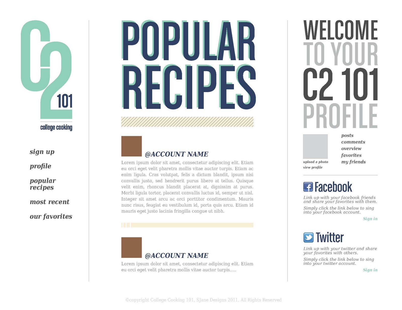 |
| C2 101 | Popular Recipe Page - Web Application | October 2011 |
 |
| C2 101 | Most Recent Page - Web Application | October 2011 |
 |
| C2 101 | Our Favorites Page - Web Application | October 2011 |
Subscribe to:
Posts (Atom)